The Guide to Graphic T-Shirts for Men
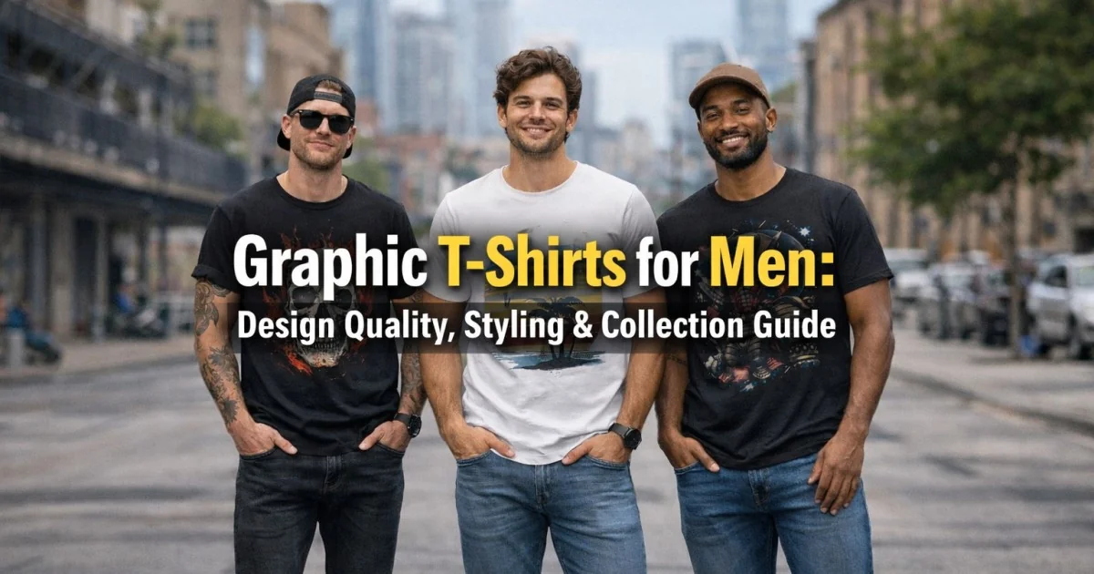
Graphic t-shirts have this interesting relationship with men's fashion. They're casual, they're accessible, and they're one of the easiest ways to inject personality into an outfit. But here's what I've noticed after twenty years of styling men: most guys either avoid graphic tees entirely because they think they're juvenile, or they wear them in a way that reads sloppy and unmemorable. There's rarely a middle ground where graphic tees are worn with intention and look genuinely good.The thing is, graphic t-shirts can absolutely work in men's wardrobes. They can look intentional. They can look sophisticated. They can communicate something real about who you are without screaming for attention. The difference between a graphic tee that looks great and one that looks like you grabbed whatever was hanging in your closet comes down to understanding proportion, color strategy, design quality, fit, styling, and when they're actually appropriate to wear.I've helped countless men incorporate graphic tees into their wardrobes in a way that feels authentic to their style while still looking put-together. And I want to share what I've learned about making graphic tees work. Because the truth is, if you understand the rules, graphic t-shirts can be some of your most interesting and wearable pieces. You just need to know how to choose them and style them intentionally.
This guide covers everything: what makes a good graphic design versus a mediocre one, how to choose graphic tees that reflect your personality, fit considerations specific to graphic tees, color strategy for printed designs, styling graphic tees for different occasions, proportioning with different bottoms, layering techniques, how to incorporate band tees and vintage graphics, the difference between intentional and accidental graphic tee styling, how to care for printed designs, and how to build a graphic tee collection that actually gets worn.
Graphic T-Shirt Quality
Not all graphic t-shirts are created equal. The quality of the base shirt, the design, and the printing process all matter enormously.
The Foundation: Base Shirt Quality
The graphic doesn't matter if the underlying t-shirt is poor quality.
Fabric Quality
- Weight matters: Mid-weight (160-180 GSM) holds graphics better than thin or heavy weights.
- Construction: Tight knit prevents pilling and distortion.
- Cotton content: Quality cotton looks and feels better than budget blends.
- Pre-shrinking: Important even for graphic tees you want the fit to remain stable.
Fit and Proportions
- Proper fit: Graphic tees should fit cleanly, not too loose or too tight.
- Sleeve length: Hits at wrist bone not drooping or too short.
- Body length: Hip-length or slightly longer for proportion.
- Shoulder seams: Sit right at shoulder bone, not drooping.
Why this matters: A beautiful graphic design is ruined if it's on a poorly fitting shirt.
Design Quality and Aesthetics
Not all graphic designs are worth wearing. Some are genuinely good; others are kitsch or poorly executed.
Good Graphic Design
What separates a quality graphic from a mediocre one:
- Clean lines: Details are sharp and well-defined, not blurry or muddy.
- Color palette: Colors are intentional and cohesive, not random or clashing.
- Proportion: The graphic is appropriately sized not overwhelming the whole shirt, not so small you can't see it clearly.
- Concept: The design has meaning or visual interest beyond just being a graphic.
- Originality: It's interesting or unique, not generic.
Poor Graphic Design (What to Avoid)
- Blurry or pixelated: Low-resolution or poor quality printing.
- Too many colors that don't work together.
- Oversized graphics that dominate the entire shirt.
- Extremely generic or clichéd concepts.
- Cheap-looking or amateur designs.
- Offensive or controversial imagery (just avoid the complication).
Printing Methods Matter
How the graphic is applied to the shirt affects durability and appearance.
Screen Printing (The Standard)
The most common method for graphic t-shirts.
- How it works: Ink is pushed through a mesh screen onto the fabric.
- Quality indicators: Clean edges, vibrant colors, ink sits on top of fabric (slightly raised feeling).
- Longevity: Can last 50+ washes if done well.
- Best for: Detailed designs, good for complex graphics.
- Feel: Ink creates slightly raised texture on shirt.
Direct-to-Garment (DTG) Printing
Modern method that's becoming more common.
- How it works: Printer directly applies ink to the fabric (similar to inkjet printing).
- Quality indicators: Very detailed, photorealistic possible, colors blend smoothly.
- Longevity: Can fade faster than screen printing if not quality ink (50+ washes if good quality).
- Best for: Photographic images, complex color gradients.
- Feel: Graphic feels more like part of the shirt rather than on top.
Heat Transfer Printing
Less common but still used.
- How it works: Design is printed on transfer material and heat-pressed onto shirt.
- Quality indicators: Can look plasticky or cheap if low quality.
- Longevity: Can crack or peel faster than screen printing.
- Best for: Basic designs, not detailed graphics.
- Feel: Can feel plasticky or stiff compared to other methods.
General rule: Screen printing is usually the most durable and looks best. Quality DTG is also excellent. Heat transfer is the least ideal.
Choosing Graphic T-Shirts That Reflect Your Style
Your graphic tees should express something about who you are, not just random designs.
Band Tees and Music Merch
Band shirts are a classic graphic tee category. They work if done right.
When They Work Well
- Bands you actually like: It should reflect genuine interest, not just the look.
- Classic or well-known bands: More universally understood and appreciated.
- Vintage or aged band tees: Often look more intentional and interesting than new ones.
- Smaller, current artists: Works if the design is interesting beyond just the name.
When They Can Look Off
- Wearing a band tee for a band you've never actually listened to (people notice).
- Very new, pristine band merch (can look like you're trying too hard).
- Extremely niche or obscure bands (not all contexts can read it).
Styling Band Tees
- Pair with fitted, tailored bottoms for balance.
- Let the band tee be the statement keep other elements simple.
- Works better with darker jeans or tailored pants than with athletic wear.
- Layer with a structured jacket or shirt for elevated casual looks.
Art and Design Graphics
Graphics that are primarily visual art rather than text-based.
When They Work Well
- Quality design: Well-executed art that's visually interesting.
- Original or interesting concept: Not something you see on every other shirt.
- Sophisticated color palette: Colors work together intentionally.
- Not too literal: Graphics that require thought or appreciation work better.
Styling Art Graphics
- Can work with more casual bottoms since they're artistic rather than cultural references.
- Pairs well with neutral bottoms that let the graphic shine.
- Works with minimalist styling let the graphic be the interest.
- Can be elevated or casual depending on how you style the rest of the outfit.
Text-Based Graphics
T-shirts where text is the primary graphic element.
When They Work Well
- Clever or witty text: Humor or intelligence in the message.
- Quality typography: The text is well-designed and readable.
- Not too much text: Simple, concise messages work better than paragraphs.
- Appropriate for context: Text that's relevant to who you are or what you care about.
When They Can Backfire
- Offensive or crude text (limits where you can wear it).
- Too much text (becomes cluttered and hard to read).
- Text that's so inside-joke or niche that nobody else gets it.
- Typos or poor spelling (immediately reads as cheap or careless).
Styling Text Graphics
- Works well for casual contexts where the message can be appreciated.
- Pair with simple, neutral bottoms that don't compete with the text.
- Works better with a more casual, relaxed aesthetic.
- Can work in smart casual if the text is clever or meaningful.
Logo and Brand Graphics
Shirts with logos or brand imagery (not to be confused with branded merchandise of bad quality).
When They Work Well
- Authentic interest: You actually use or care about the brand.
- Vintage or heritage logos: Old logos often look better than new ones.
- Simple, classic designs: Clean logos work better than complex ones.
- Interesting or respected brands: Not just any logo ones that people recognize and respect.
When They Can Seem Inauthentic
- Wearing logos of brands you don't actually use or care about.
- Multiple logos on the same shirt (looks like walking advertisement).
- Very new logo merchandise (feels like branded marketing).
Fit Considerations Specific to Graphic Tees
Graphic tees have unique fit considerations because the graphic affects how they read.
Proportion of Graphic to Shirt
Size of Graphic
- Small graphic: Subtle, can look sophisticated. Works for more occasions.
- Medium graphic: Balanced clearly visible but not overwhelming.
- Large graphic: Statement-making, very casual, harder to dress up.
- Oversized graphic: Definitely casual, requires intentional styling, can overwhelm smaller frames.
General recommendation: Medium to slightly-large graphics are most versatile. Oversized graphics limit versatility.
Placement of Graphic
- Chest placement: Most common, naturally frames the graphic.
- Over-centered or off-center: More interesting, modern feel.
- Full-front print: Very bold, very casual.
- Small graphic (like pocket placement): Very subtle and sophisticated.
- Back print: Changes how the shirt reads depending on context.
Base Shirt Fit with Graphics
- Graphic pulls tight fabric: Oversized shirt can prevent this but might look sloppy.
- Properly fitted shirt: Graphic looks better proportion-wise and reads more intentional.
- Attention to seams: Graphics that sit awkwardly relative to shoulder seams or sleeve edges look off.
Body Type Considerations
Larger or Broader Builds
- Larger graphics: Look more proportional on larger frames.
- Multiple-color graphics: Draw attention and interest in a balanced way.
- What to avoid: Very small graphics can look lost on a larger frame.
Smaller or Slender Builds
- Medium to smaller graphics: Look more proportional on smaller frames.
- What to avoid: Oversized graphics on oversized shirts can overwhelm smaller frames entirely.
- Fitted shirts: More important for smaller frames to ensure proper proportions.
Color Strategy for Graphic Tees
The base color of the shirt matters as much as the graphic design itself.
Black Base (Most Versatile)
Black works with almost any graphic design.
- Why it works: Universal, professional, allows graphic colors to pop.
- Graphic appearance: Colors appear vibrant against black background.
- Styling: Works casual or smart casual depending on graphic.
- Occasions: Most versatile base color for any graphic.
White Base (Clean and Bright)
White creates a clean, fresh aesthetic.
- Why it works: Very clean, bright, summery feel.
- Graphic appearance: Inks look vibrant and clear on white.
- Consideration: Shows stains more easily than dark shirts.
- Styling: Slightly more casual feeling than black.
Navy Base (Sophisticated)
Navy is slightly more sophisticated than black while still very versatile.
- Why it works: Warm and approachable while still polished.
- Graphic appearance: Colors show well, less harsh than black background.
- Styling: Works for smart casual looks.
Gray Base (Friendly)
Gray creates a casual, friendly vibe.
- Why it works: Casual but balanced, works with many graphics.
- Graphic appearance: Colors show well against gray.
- Styling: Definitely leans casual, harder to dress up.
Colored Base (Use Strategically)
Colored shirt bases (olive, burgundy, etc.) can work but require careful consideration.
- When it works: Graphic colors complement the base color intentionally.
- When it doesn't: Graphic colors clash with or compete with base color.
- Risk: Higher chance of color clash or visual discord.
- Recommendation: Stick with black, white, navy, or gray for most graphics unless graphic colors are specifically chosen to complement base color.
| Base Color | Versatility | Graphic Appearance | Formality Level | Best Occasions |
|---|---|---|---|---|
| Black | ★★★★★ | Vibrant, clean | Neutral to elevated | Any, especially smart casual |
| White | ★★★★ | Vibrant, clear | Casual | Casual, warm weather |
| Navy | ★★★★ | Good contrast | Smart casual | Office casual, casual dinner |
| Gray | ★★★ | Good contrast | Casual | Casual, weekend |
| Colored | ★★ | Variable | Casual | Limited, requires coordination |
Styling Graphic Tees for Different Occasions

Casual Everyday
Graphic tees are at home in casual settings.
- Outfit: Graphic tee + jeans + sneakers (the classic).
- What works: Any well-designed graphic, any base color.
- Key: Keep bottoms simple and well-fitting to balance the graphic.
- Accessories: Minimal let the graphic speak.
Smart Casual or Office Casual
Yes, graphic tees can work here if chosen and styled carefully.
- Outfit: Graphic tee (sophisticated design, neutral base) + blazer + tailored pants.
- What works: Sophisticated, artistic, or subtle graphics. Black, navy, or white base.
- What doesn't work: Loud, offensive, or novelty graphics.
- Key: The blazer is crucial it elevates the graphic tee significantly.
- Accessories: Watch, subtle jewelry keep it refined.
Weekend Casual
This is where graphic tees shine.
- Outfit: Graphic tee + chinos or shorts + sneakers or casual shoes.
- What works: Any good graphic, comfortable styling.
- Key: Bottoms should be clean and well-fitting for balance.
- Relaxed but intentional: Looks like you got dressed, not just threw on whatever.
Going Out / Casual Evening
Graphic tees can work for casual night out scenarios.
- Outfit: Subtle or sophisticated graphic + dark jeans + nice shoes (leather boots, clean premium sneakers).
- What works: Black or navy base, sophisticated design, not oversized.
- What doesn't: Loud, novelty, or oversized graphics.
- Key: Shoe choice matters elevate with leather or premium sneakers rather than athletic wear.
Proportioning Graphic Tees with Different Bottoms
With Fitted or Slim Jeans
Why it works: Fitted bottoms balance the statement of the graphic.
- Best graphic tees: Any fit works, but properly-fitting tees look cleanest.
- Proportions: Volume on top (from graphic focus), definition on bottom (fitted jeans) = balanced.
- Styling: Very versatile combination.
With Relaxed or Straight-Leg Jeans
Why it works: Relaxed jeans match the casual vibe of most graphic tees.
- Best graphic tees: Medium-sized graphics work well.
- Proportions: More all-casual look, very accessible.
- Watch out for: Too-loose everything can look sloppy both tee and jeans need proper fit.
With Chinos or Tailored Pants
Why it works: Tailored bottoms dress up the casual graphic tee.
- Best graphic tees: Sophisticated designs, solid colors (black, navy, white).
- Proportions: Graphic tee + structured bottoms = smart casual.
- Key: The structured bottoms do most of the "dressing up" work.
With Shorts
Why it works: Graphic tees are perfect for warm weather casual.
- Best graphic tees: Any graphic, but proportions matter (don't overwhelm legs).
- Proportions: Shorter bottoms mean visible legs, so graphic shouldn't be overwhelming.
- Shoe choice: Clean sneakers or casual shoes, not athletic wear.
Layering with Graphic Tees
Graphic tees layer beautifully and this is how you make them work in more occasions.
Graphic Tee + Blazer
This combination instantly dresses up a graphic tee.
- Works with: Any well-designed graphic, neutral base colors.
- Effect: Transforms casual graphic tee into smart casual.
- Styling: Blazer open or closed both work.
- Why it's effective: Structured jacket elevates casual tee completely.
Graphic Tee + Open Shirt
Layering with an unbuttoned shirt creates visual interest.
- Works with: Contrasting colors (light shirt over dark tee, dark shirt over light tee).
- Effect: Creates intentional layering that looks contemporary.
- Styling: More casual than blazer but still interesting.
Graphic Tee + Cardigan or Casual Sweater
For cooler weather, this works beautifully.
- Works with: Any graphic, but color coordination helps.
- Effect: Casual but layered and intentional.
- Styling: Cardigan can be buttoned or open for different vibes.
Graphic Tee + Jacket (Denim, Bomber, Coach Jacket)
Casual layering that works for almost any setting.
- Works with: Most graphics (jacket softens the statement).
- Effect: Casual but more structured than tee alone.
- Styling: Very versatile combination for casual to smart casual.
Vintage and Band Tees: Special Considerations
Vintage and band tees have their own rules.
Vintage Band Tees
- Appeal: Authenticity actual old merchandise from real shows or eras.
- Styling: Often look better worn in slightly more casual contexts to show authenticity.
- Fit: May not be perfect by modern standards, but that's part of the appeal.
- Caring for them: Gentle care is crucial these are collectible.
Modern Band Merch
- Authenticity: Must reflect actual interest in the band people notice.
- Design quality: Modern merch varies widely seek out quality designs.
- Styling: Works like any other graphic tee.
Making Band Tees Look Intentional
- Pair with tailored bottoms for elevated casual look.
- Layer with jacket or blazer for structured context.
- Avoid pairing with athletic wear (changes the vibe to sloppy).
- Clean, quality shoes matter elevates the whole look.
Caring for Graphic Tees to Preserve Print Quality
Graphics require special care to maintain their appearance.
Washing Graphic Tees
- Turn inside out: Protects the graphic during washing.
- Cold water: Hot water can set or fade prints.
- Gentle cycle: Reduces mechanical stress on print.
- Don't overload: Gives graphics room and reduces friction.
- Gentle detergent: Harsh chemicals can fade prints.
Drying Graphic Tees
- Never machine dry: Heat damages prints and base shirt.
- Air dry flat: Best method for preserving graphics.
- Indoors: Direct sun can fade prints over time.
- If hanging: Padded hanger only, avoid pulling print area.
Storing Graphic Tees
- Fold, don't hang heavy tees: Prevents stretching.
- Store flat: Reduces print stress.
- Cool, dry place: Moisture can damage prints.
- Protect prints: Don't let other garments rub against prints during storage.
Building a Graphic Tee Collection
Foundation (Start Here)
- 1-2 graphic tees with sophisticated designs (not overly loud).
- Neutral base colors (black, white, navy).
- Quality base shirt, good printing.
Bridge (Add These)
- 1-2 band or artist tees reflecting genuine interests.
- 1 graphic tee with artistic or design-focused graphic.
- Variety in base colors (black, navy, white).
Personality (Your Collection)
- Graphics that genuinely reflect interests and personality.
- Mix of designs: band tees, artistic graphics, text-based.
- Quality matters more than quantity.
What Makes a Graphic Tee Worth Keeping
- Good quality base shirt and printing.
- Design you genuinely enjoy and will wear repeatedly.
- Works with multiple items in your wardrobe.
- Reflects something real about you.
The Real Appeal of Graphic Tees
Graphic tees are wonderful because they're one of the most accessible ways to express personality through clothing. They can be casual or dressed up. They can be fun or sophisticated. They can tell stories or make statements. The key is choosing designs that genuinely matter to you and styling them intentionally so they look like deliberate choices rather than random grabs from the closet.
Once you understand how to choose quality graphics and style them well, graphic tees become some of your most interesting and wearable pieces. They're not childish or sloppy they're just another tool in your wardrobe for expressing who you are.
